
CHROMAZONE – HOW TO GET TO THAT FIRST REVEAL
ChromaZone, Paula Nadelstern’s 14th fabric collection for Benartex, will premiere at International Quilt Market in Houston this year. Benartex will give away one set of half yard cuts of the entire ChromaZone fabric line. Read more in this post.
Companies like Benartex who design and print our quilt fabrics are called converters, because they convert greige goods into the prints we buy in the quilt stores. Greige goods (pronounced gray) are raw fabrics before they undergo dying or bleaching.

I don’t have an art or textile design background. My degrees are in Occupational Therapy with a Masters in Psych, although I haven’t worked in the field for a very long time. Until my accidental apprenticeship with knowledgeable Benartex designers, everything I knew about color I learned as a kid from my prized box of sixty-four kid-worthy crayons.

I work with the Benartex Creative Director and Stylist, Ruth Beck, and a clever, creative CAD artist who gets me. They help take my “What If” ideas all the way to the quilt shop. Ruth is responsible for marrying trend with design, color and technique. Equally important, she has production know-how and understands the nitty gritty of how to print on cloth (which is very different from paint or CAD processes) and how to communicate effectively with the Korean mill.

Keep in mind, I’m not only a fabric designer, I’m also an art quilter who uses fabric with luminosity and shading in her series of kaleidoscopic quilts, and I’m a teacher whose students’ success often relies on fabrics that mirror image. When I set out to design a new collection, I’m balancing these three aesthetics.

My goal is to design beautiful stuff that can be used in a myriad of ways for anyone’s piecing adventure, not just to be used to make kaleidoscopic designs. I welcome color and motif inspiration whenever I’m lucky enough to notice it: an elevator door, a set of Italian dishes, a painting at the Met, the arabesque patterns in the Sheikh Zayed Grand Mosque on a teaching trip to Abu Dhabi.

From the start, ChromaZone was to be about color. Lots of it. The title was the product of a brainstorming session fueled by a lovely Sangria in Casa Hidalgo, a fish restaurant in Sitges, Spain where me and my three best quilting friends were exhibiting our Semper Tedium quilts—but that’s another story.

It was also intended to be a relatively small group taking less time than usual because of my extensive 2014 travel schedule. With this in mind, I began by making mock-ups using artwork from previous collections. Since I don’t create on the computer, I physically cut and collaged actual fabric. The CAD artist scanned these and then skillfully used Photo Shop to move them toward a finished product. I sit at a computer a few feet from her so we can collaborate easily.

Months later, an existing design called Dragon Feathers turned into Dragon Medallions, Magmatude evolved from Magma, and I re-colored a previous allover called Sunstone to work with the new group. Vox is brand-new artwork, taking on the role of a great ombré stripe which automatically slides the eye from here to there, forming visual pathways that instill an element of motion. We had ambitiously over-designed the previous collection, Fabracadabra, which turned into a collection too big for marketing purposes. The leftover, Filigree, was adapted for ChromaZone.

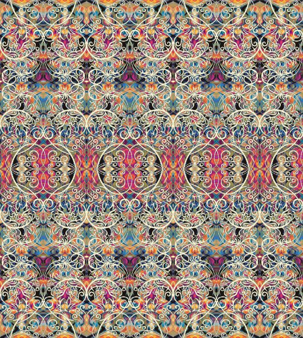
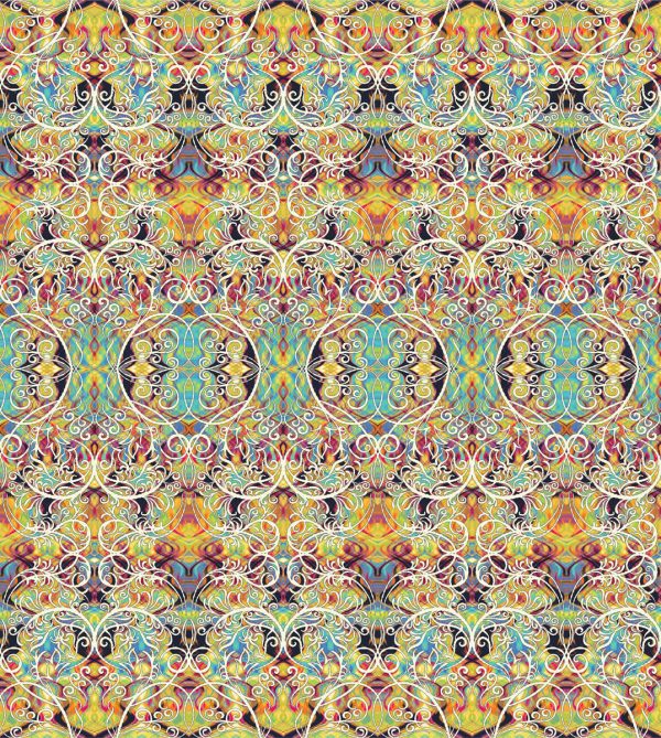
I color the line on a computer in the Benartex studio using textile design software called Evolution. As I’m coloring, I’m fascinated by the idea that I can cause different color ways of the same design to function in diverse ways. In one colorway, a contrasting motif might pop and create a visual line when it connects to its repeats. In another, the same motif may be colored in a hue that softens it so it recedes (rather than pops) or connects it to a neighboring motif (rather than standing out on its own). Some of this is serendipity, some contrived by me but ultimately it means I have a bigger “vocabulary” to work with. You can see what I mean by looking at the four colorways of Magmatude.
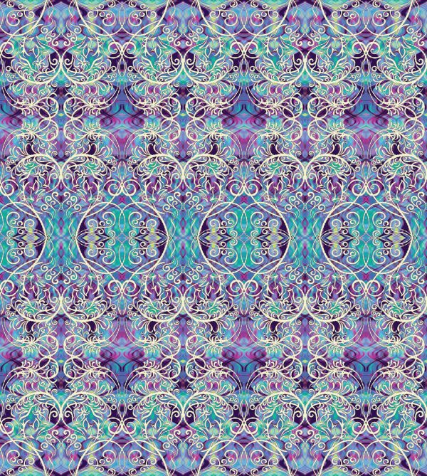
ChromaZone has five patterns in four colorways. I always do a Blue group (because I know it will be the most popular) and I always include a Multi filled with lots of different colors. The new direction this time is a Christmas color story, as true to the iconic colorway as I am capable of since I’m programmed to believe that when it comes to color, more is more. The Caribbean group was inspired by a teaching cruise to the Bahamas.
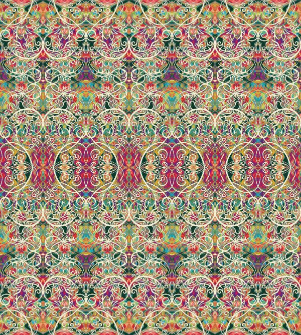
This collection has a more painterly quality than usual. In previous collections, most of the designs have a precise quality with clear definitions of the motifs because each element is outlined. The outline keeps each color contained in its position. Without an outline, a painterly effect is created because one color might fall-on another producing a third color. This is called trapping. Fall-ons are less apparent when it’s a fabric with a single color story, like shades of yellows. The role of the outline is to separate colors that don’t make good neighbors, like orange and green which can generate an unwanted muddy brown where they touch each other. The painterly approach made a difficult job even harder for the stylist whose job is to make sure that what I create on paper can be produced on fabric. A good example of both of these effects can be seen in the pattern called Filigree. The colorful, painterly pattern in the background is not outlined while the prominent white scroll is outlined in black so the white stays fixed.
It takes a long time, at least 6-9 months, from the day the three of us meet to discuss the new line to the day it is sent to the Korean mill for the first strike-offs. A strike-off is a test length of fabric printed by the mill in order to check the pattern registration and colors. From strike-offs to actual fabric is about three months. I live in the Bronx (which is the most northern borough of New York City) and typically commute downtown to Benartex by subway for at least 3 months almost full time, broken up by teaching commitments. I don’t do any of the coloring at home because I don’t have the computer software or large format printers.
Welcome to the ChromaZone.
It’s give-away time:
We have a give-away of one set of half yard cuts of the entire ChromaZone fabric line. Simply comment on the post to answer the following question: How would you incorporate ChromaZone in your next project?
A winner will be drawn randomly on October 26. Good luck!
13 THOUGHTS ON “CHROMAZONE – HOW TO GET TO THAT FIRST REVEAL”
LEAVE A REPLY
You must be logged in to post a comment.


I LOVE this new color line ChromaZone! I would use the Caribbean group to make a new quilt for our guest bed. Thank you for the information above. Quite interesting.
Wow, those are sure pretty! I would use the material to make some really stunning handkerchiefs!
Congratulations on the new line- it’s really interesting! I’m looking forward to seeing how it inspires others. Great work Paula & Benartex!
These are absolutely breathtaking! Quite honestly, I’m not sure how I would use them, as I would need to lay them out and play with them (fondle them, as my husband says). I’m leaning toward kaleidoscopes, probably in an art quilt, but they may tell me they want to be something entirely different!
I would like to use Filigree Red and Green with Sun Stone Fuschia to make a set of quilted placemats.
The would be outstanding. Thank-you so mush for the new collection.
Wow! That is beautiful! I’m not sure how I would use it yet, probably look at it for a long time until inspiration struck.
I’m not sure exactly what I would do with this collection. I just know that on first glance, I’m mesmerized. I’ll think of something. Maybe a stunning table runner
I would love to use the Christmas motorway in a new Christmas quilt design.
Paula this new fabric line is exquisit. I enjoy creating kaleidoscope quilts as wall hangings.
Congratulations!
I love the colorways… I think I will need all of the colors… and I want to use some in a quilt and in a purse/bag and in a vest perhaps….
Fun stuff!! so enticing!
Wow, those are all beautiful. I would like to take many of the prints, and surround them with a lot of solids, to make them really pop!
This beyond gorgeous. I am making a La Passacaglia quilt. These fabrics are perfect for this quilt’s fussy cutting.
Hello Paula,
I would use this collection by fussy cutting the Christmas Filligree and the Kaleidoscopes for a quilted Bolero and party dress for our 2 1/2 year old Grand-daughter for the Holiday season and on into the Spring with lace petticoat and Bolero Cuffs.