Search This Blog

Thursday, May 29, 2014

WHAT IS REDWORK?

A Patchwork Garden Year Redwork Block of the Month
One lovely project we found at the Spring 2014 Quilt Market the other week is a Redwork Block of the Month program.  We've been searching for a nice Redwork pattern(s) for a while now, and we're just thrilled to have found this one.

It is A Patchwork Garden created by Kathy Schmitz for Moda.  She has created twelve 12" square blocks of fun designs - not too cute and not too sophisticated.  Additionally what we loved about this Redwork program is that it is not traditional redwork.  We're going to suggest that you use different shades of red Perle Cotton thread (or DMC floss).  The redwork embroidery will actually be done on a dark beige, or tan if you will, fabric that also has a crackled texture on it.  And then the pieced blocks surrounding the embroidery will be a mix of lovely graphic designed fabric of reds and creams.  The fabric will be from Moda's collection - A Patchwork Garden.

But what is Redwork, or traditional Redwork?

Traditionally the floss used is a DMC floss, usually color #321, but there have been some variances.  And once the red color selected, it would be used throughout the entire needlework.  Also the embroidery is usually done on a muslin and the pieced work surrounding the embroidery has been done using solid reds, whites and or cream fabrics.

The craft of Redwork is a style of decorative needlework that has been around since Victorian times, the late part of the nineteenth century.  It was a technique used to teach young girls their stitches that consists of embroidering the outline of designs onto a white or off-white background with a contrasting color thread.  It was also something the more wealthy ladies did, since they did not have to do "housework."

This simple, yet striking style is called Redwork for several reasons. Red thread is typically used in this style because the red color contrasts well against a light background also, during the nineteenth century when the style first became popular, artists could obtain a red thread that was "colorfast," meaning that the red coloring would not wash out or "bleed" onto the white fabric.  However this same type of needlework has also been done in blues and blacks as well. Today you might Redwork designs done assorted red colors to add depth or in a variegated red (or blue). We're rather excited about our new program!  It will begin October 2014.  We encourage you to sign up now in order to participate for our Patchwork Garden Year Redwork Block of the Month.

Wednesday, May 21, 2014

WHAT IS 'GRAYSCALING?'


One thing we love to do is help our customers put fabrics and colors together.  We find that there are many quilters out there who are just quite timid about selecting their own fabric. Especially when they find a pattern they'd like to do.  Fortunately for us it is something we LOVE to do!

However - we want to show you one way that might be easier for you to select your own fabric and feel pretty confident that it will work.

One technique is called "grayscaling" the design.  Simply put, you're just taking a picture of a finished pattern presented to you in color and "graying" it out (changing it to Black and White). 

There are numerous ways to change a color picture to black and white and it depends on how tech savvy you are, but one simple way is to print the picture/pattern in black and white.  When you grayscale, then you can see the actual color values of what you need to look for in terms of light, medium and dark.

This method does 2 things - first it shows you the color values of where it is light, medium and dark.  Secondly by printing the pattern in black and white subdues the actual fabric print(s) used in the quilt that might prove distracting to you if seen in color.  Meaning let's say a pattern uses floral for a large center block, but you'd like to use this really great geometric fabric print you saw, or maybe it's a dog, or... By printing the picture in black and white reduces some (not all) of the distinguishing characteristics.   Additionally it may help to point out whether you need a fabric that might require more texture in one area and maybe not in another.  For example see below.


Friday, May 9, 2014

Using Mirror Tiles for One Block Wonders, Kaleidoscopes...

Last week a customer of ours, Louise, came in to pick up a quilt that Jami had quilted for her.  When Jami opened it up for her to see the work - well I saw it was, more or less, a kaleidoscope quilt.

Now why I didn't take a picture of it to show you, I have no idea.  But I didn't.  However I noticed that the kaleidoscope blocks weren't done in the "Paula Nadelstern kaleidoscope method" that I'm more familiar with.  So I questioned Louise.  She said it was a One Block Wonder.  In the same breath, she said she wasn't completely happy with it.  We were, but we asked her why she wasn't.

Those of you familiar with One Block Wonders know that you make the blocks and quilt from just one piece of fabric.  The One Block Wonder began with Maxine Rosenthal & Joy Pelzmann who have written books - ONE BLOCK WONDER and ONE BLOCK WONDERS ENCORE!  The first book  - One Block Wonder - explores ways in which you simply use one piece of fabric and how to put all the colors together.  Their next book, One Block Wonders Encore, not only explores additional ways to piece a kaleidoscope quilt with one fabric, but it also shows you how to place cubes within, or use 2 different color ways of the same design, or 2 different designs in the same color way... Oh so much to try!

Louise thought that hers was too mushy/muddy.  She said that she wished that she had more "white space" between the motifs.  To solve her issues with what she had done, she grouped the block colors together and in our opinion we thought it just all flowed very wonderfully together.

However we further discussed what type of fabric she would have preferred, so we began pulling some pieces off our shelves to examine them using our mirror tiles.  Below are a series of videos showing you 3 types of fabric designs.  One thing we all knew - you want a fabric that has a lot of color.  You also want to find a fabric where the motifs are a good size medium, to large design.

Our conclusion, really -- it's truly up to you as to what type of kaleidoscope effect and quilt design you're looking for -- haha, sorry.  However one way to figure that out is to use this simple Mirror Tile.  You simply move it around that fabric to see what types of kaleidoscopes you can make from the fabric.

For example, this first video shows you a fabric that has lots of white background showing. Lots of space between each design.  The designs are a good medium size.  Our personal point of view is we don't think this would work, unless you wanted to do a great deal of fussy cutting.


In this second video - here you see large motifs sitting tightly together, and one on top of another.  There's also lots of color, which is good, and as you can see as the mirror tiles move around, the colors just explode!  However - depending on how you lay it all out, well it might become a bit blendy/mushy.  Not that that's a bad thing - it's just a question of what effect you're trying to create.


This final video shows you a fabric of medium size motifs. Lots of color.  Definite white space around, sort of shares the background with the lime green.  Again - it truly depends what kind of effect you're looking for.  But because of all it's variety, it just seems to give you a lot of options - we think. Maybe. 

Anyway we hope you'll see what we're trying to show you.  Hope you take the plunge and give it a try.


Wednesday, April 30, 2014

Raw Edge Applique using 100wt Thread

Recently we received a question from one of our customers regarding the use of the InvisaFil 100wt thread in her machine in order to do raw edge applique.  She was having some difficulty with the thread continually breaking.  She wasn't sure if it was her tension or the needle, or what?

So we contacted our "Thread Queen" Carol to see if she had any suggestions, and/or recommendations.  First InvisaFil, from Wonderfil Thread, is a 100 wt cottonized soft polyester thread. Tone on tone, InvisaFil virtually disappears into the fabric and works beautifully for machine and hand applique.  And it is available in 60 colors.

Carol suggests that the thread be used both in the top and the bottom.  She even suggests lowering the feed dogs, and she set her tension at 2.  The needle she does like to use is Superior's Titanium Topstich 70/10 (which we are getting).  And she tried both a straight and zigzag stitch.  


Below is a video produced by Wonderfil, and as she says on the video she was using an 80 needle and might switch to a 90.

The take away on all this is before working directly on your project - try it out on test pieces first before you make yourself too frustrated.  We'll let you know how our customer fared after she tries some of Carol's suggestions.


Wednesday, April 23, 2014

REMEMBER MACHINE QUILTING IS ALL ABOUT THE GLIDE

Now they tell me!  It's all about the "glide" as you machine quilt! 

Recently I returned to machine quilting because I had a baby quilt to do.  Not only did I not have the time to send it to a long-arm quilting, but (and let's be honest here) I did not want to go to the added expense. 

So I tried my hand at machine quilting, yet again.  Of course it had been some time since I last tried machine quilting myself.  There was a lot to remember - feed dogs, walking foots... and then of course the quilting design.

I did it.  I finished it.  But oh it was slow going and hard to do.  Mainly because I felt the quilt was just not moving very easily in the machine.   

Of course about 3 weeks after I finished my baby quilt - both Patty and Cheryl come in saying how they just completed their small quilts (one was a wall hanging, the other was a baby quilt) - teaching themselves new machine quilting techniques-- how easy it was and what they learned from it all.  I was amazed and asked them, how could it be easy.  Isn't it just hard moving the quilt around "free motion" style - how can their designs be so consistent.

They both said - for starters, it's all about "the glide." They both use The Supreme Slider.  I also know Carol uses it as well.

What I've since found out is your quilt needs to be able to glide smoothly.  You don't want to experience that dreaded drag.  That friction or drag is caused in 2 ways.
  1. If your quilt top slips over the edge of your table surface, well that becomes additional weight and can pull your fabric enough to cause problems such as flexing the needle and slow things down.  What you need to do here is create a big enough and as flat enough surface so that your quilt is not draping downwards.  Don't worry, you can feed the quilt through and have it drag below the needle - but as it moves towards and through the needle - you want the quilt to remain as flat as possible over a much larger surface in order to displace the flex and drag.
  2. The top of your surface on which your fabric moves through must be extremely slippery.   Therefore it is recommended to first thoroughly clean the table top surface your quilt will be on.  Then you could spray that surface with a furniture or car polish or fabric-safe silicone upholstery spray.  (Remember always test these products on a fabric sample first.) 
But rather than risk ruining your fabric - there is an absolutely fabulous product -- The Supreme Slider. It is the most slippery surface out there in a product of this nature. This siliconized slider clings to your machine and table from one side without adhesives, while the topside allows your fabric to slide easily around as you sew.  If it becomes less clingy as the fabric dust accumulates, just rinse it off and let it dry.  The Supreme Slider comes in 2 sizes - small and large - and can be trimmed down to what you need/want.

Another tip, is spray starch your backing, so that it becomes stiff making the glide oh so much easier.


The Supreme Slider 


Follow us on Facebook
 Follow us on Twitter


Tuesday, April 22, 2014

Luminosity at its BEST!

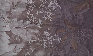
Well admittedly - it's been awhile.  But I'm back in action.  We have some unbelievably gorgeous ombres to show you.  Truly they are ombres at their best.  A fabulous design of large floral leaves.  At the selvage it is at its darkest, but as the color moves towards the center/fold of the fabric it lightens up, then goes from light back to dark on the other side of the fabric and mirroring the floral images. 

What makes this ombre so amazing is on the larger floral leafs are highlighted with a touch of an all together different color that is simply luminous - truly breathtaking.
Serenity
Enchanted Ombre - Coffee


http://www.cottonclub.com/cgi-bin/Store/store.cgi?&product=Serenity_&productid=SR245&sales=0&lastmenu=submenu-2500.html
Enchanted Ombre - Storm


http://www.cottonclub.com/cgi-bin/Store/store.cgi?&product=Serenity_&productid=SR246&sales=0&lastmenu=submenu-2500.html
Enchanted Ombre - Charcoal

Monday, March 11, 2013

There is a reason for Stash Building!


Here is a quilt that Carol did.  The pattern used is Prairie Peony.  It is a mix of piecing and applique.  We have put this together as a kit (and is currently available), however Carol decided she first wanted to see if she can find all the fabric she would need in her stash.  Well, much to our dismay (haha) at our shop, she did find everything she wanted.

First you must understand Carol did not have a totally thought out plan as to how she wanted to do this quilt.  She knew she wanted the blocks to be done a  lot more brightly than what is shown on the pattern.  She also knew she wanted to use a lot of her small-scaled prints.


When it was time to put the blocks together and selecting the sashing, as you can see she selected a lot of dark valued fabric in the tones of the colors used in her blocks.  This sashing helped to pop out her blocks.

But what we found so remarkable (and in hindsight even Carol) was the border fabric she found hidden in her stash!  The border print is a Michael James fabric that came out nearly 10 years ago.  The colors in the border match absolutely perfectly with the sashing used.  And since this Michael James fabric has a sort of "ombre" effect to it, the lighter colors that arise occasionally - well they just help to bring out the blocks and the colors used within them.  We think the border just truly made this quilt.

Guess the overall point I'm trying to make, especially for a new quilter.  Though it may seem costly and a bit insane.  And if you're at all like me when I first began to quilt, thinking I will not buy more fabric until I have this "one quilt project I'm working on done."  Well building stashes truly have a real purpose.

Don't be afraid. Don't be afraid that you may not like that fabric later on.  You may, or may not.  But the one thing I can say somewhat safely (though I'm sure someone out there will prove me wrong - haha) - your color palette will pretty much remain the same throughout your life.  You may skew brighter at times and duller at other times.  But I feel reasonably certain that you will find that your stash really contains mostly "your" colors in different values.

Pefect for a quilt!